The Page Parts Library
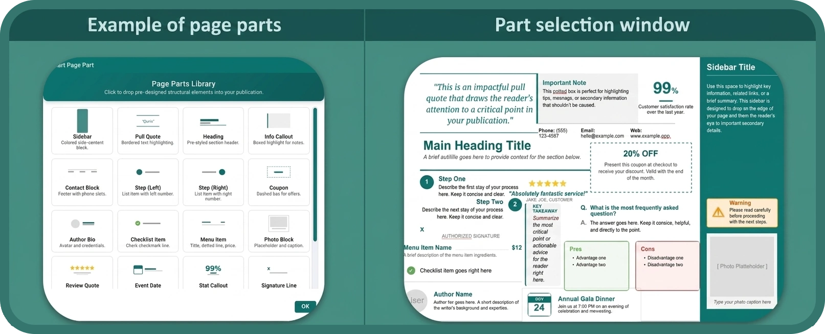
The Page Parts library provides 20 professional, drag-and-drop structural building blocks that automatically inherit your document’s current colour scheme and fonts. Rather than building common layout components from scratch, you can insert a ready-made, on-brand block and simply fill it with your content.
Opening the Page Parts Library
Go to Insert > Page Parts. The library opens and displays all available components.
Available Page Parts
-
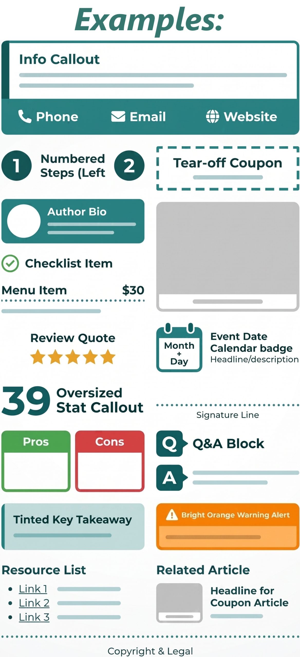
Info Callout – Tinted box with a thick left-hand colour accent, ideal for tips or warnings.
-
Contact Block – Wide footer block with Phone, Email, and Website placeholders.
-
Numbered Steps (Left & Right) – Bold circular numbered graphic, alternatable for zig-zag step layouts.
-
Tear-off Coupon – Classic dashed-border box for special offers.
-
Author Bio – Horizontal profile block for an avatar, credentials, and background text.
-
Checklist Item – Text item with a green circle and checkmark.
-
Menu Item – Restaurant menu item with a title, price, and dotted leader line.
-
Photo Block – Grey image placeholder with a caption slot.
-
Review Quote – Customer testimonial block with 5 golden stars.
-
Event Date – Calendar badge (Month + Day) alongside a headline and description.
-
Stat Callout – Oversized bolded number layout for highlighting key statistics.
-
Signature Line – Classic dotted “Sign Here” block.
-
Pros & Cons – Two-column list with a green Pros section and a red Cons section.
-
Q&A Block – Question and Answer pair with bold coloured Q/A markers.
-
Key Takeaway – Tinted summary box for highlighting the most important point in a document.
-
Warning Alert – Bright orange caution box for critical steps or potential dangers.