
The Application Interface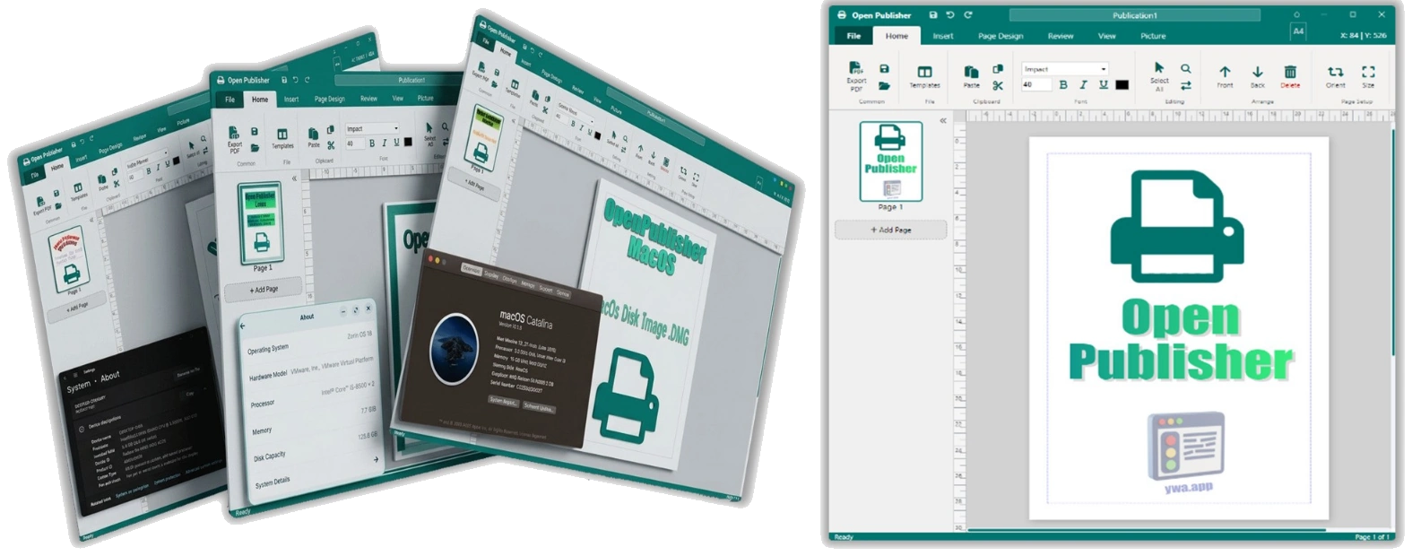
When you first open OpenPublisher, the workspace is divided into five key areas:
-
-
-
Area Description Ribbon The tabbed toolbar at the top. Contains all tools, organised into tabs: File, Home, Insert, Page Design, Review, View, and contextual tabs that appear when elements are selected. Canvas The central white page area where you design your document. Navigation Pane (Sidebar) The panel on the left showing thumbnail previews of all pages in your document. Status Bar The bar at the very bottom of the screen. Displays the current zoom level with a slider control, cursor coordinates, and page information. Floating Toolbar A compact, context-sensitive toolbar that appears directly above selected text boxes, providing quick access to typography controls without navigating the ribbon.
-
-
The Ribbon

The ribbon is organised into tabs. Clicking a tab reveals a new row of tool groups relevant to that area of the application. When you select an element such as a text box, image, shape, or table, Open Publisher automatically switches to a contextual tab (e.g., Text Box Tools, Picture Tools, Drawing Tools, Table Design) that contains controls specifically relevant to that element type. Each contextual tab includes an Arrange group for positioning, sizing, layering, rotating, and deleting elements.
If the ribbon is too narrow to show all its tools at your current window width, translucent scroll arrows appear at the left and right edges of the toolbar, allowing you to pan horizontally through the full set of tools by clicking and holding them.
The Navigation Pane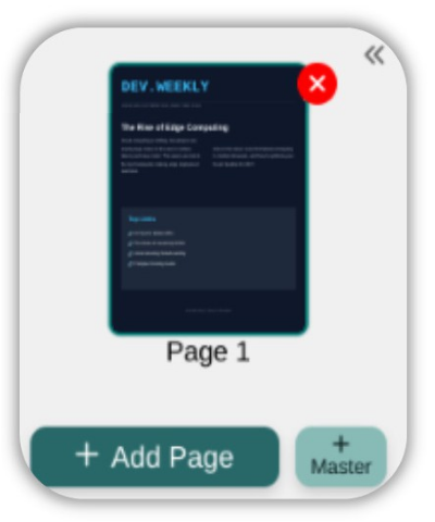
The left-hand sidebar shows a vertically scrolling column of miniature page previews. These thumbnails are automatically refreshed whenever you make changes to your document, giving you a real-time map of your entire publication. Right-clicking anywhere in the blank grey area of this sidebar opens a context menu with quick access to page management actions such as inserting, duplicating, and deleting pages, as well as document-level settings.
The Status Bar
The status bar at the bottom of the screen contains the zoom slider — a control inspired by Microsoft Publisher and Word. It features:
-
A minus (-) button to decrease zoom by 10% per click.

-
A draggable slider for smoothly scrubbing between 10% and 300%.

-
A plus (+) button to increase zoom by 10% per click.

-
A percentage readout that shows the current zoom level. Clicking this readout resets the view to 100%.
-
A Pan Tool toggle on the far left that locks your canvas elements in place, turning your cursor into a hand so you can click and drag the canvas freely without accidentally moving design objects.
The Floating Toolbar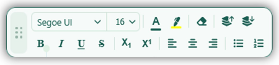
When you double-click into a text box to begin editing, a compact floating toolbar materialises above the text box.
This “Frost Mint” styled bar
provides immediate, one-click access to font family, font size, bold, italic, underline, text colour, highlight colour, and text alignment — all without leaving the canvas. The toolbar remembers exactly where you position it on a per-element basis, so it will reappear in the same spot the next time you select that same text box.
Startup & Splash Screen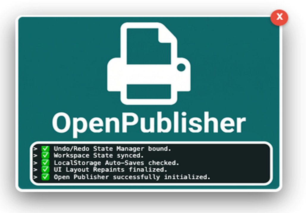
When Open Publisher launches, a dynamic splash screen appears as a draggable floating modal
window. It provides a real-time scrolling terminal output of all the core modules and features being initialised in the background — bridging the brief gap between clicking the app icon and the fully interactive workspace appearing.
The splash screen includes a dynamic progress bar synchronized to the percentage of features loaded, and uses a realistic “boot physics” engine that simulates the stuttering terminal feel of a heavy operating system startup. Once the boot sequence completes, the modal begins a short countdown before fading out automatically. Pressing any key during this window will keep the modal open indefinitely so you can review the log output.
The Startup Dashboard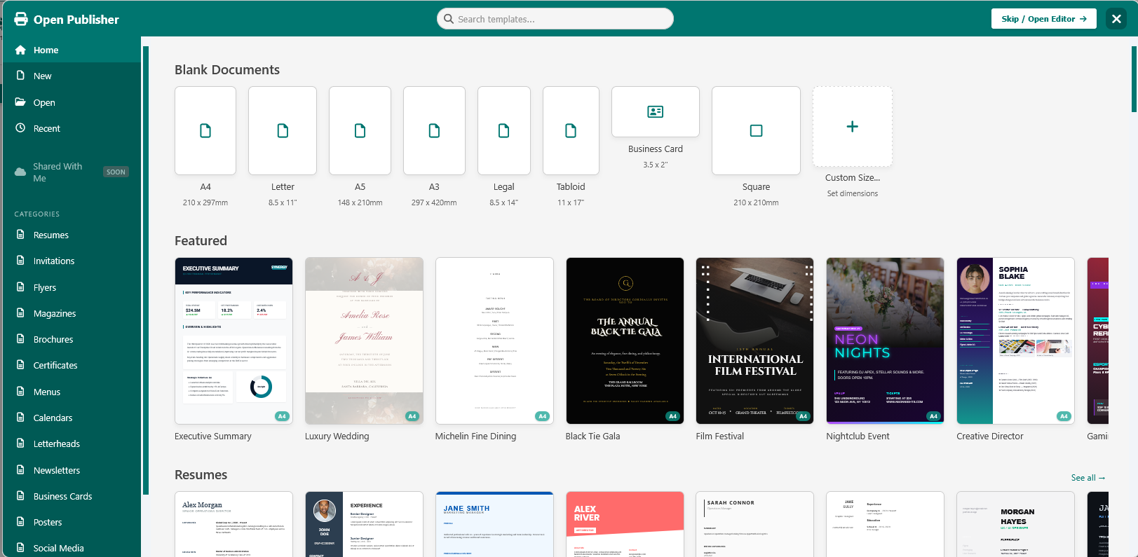
The Open Publisher dashboard is a, 90% ~ 95% full-screen draggable modal window with a light dark (depending on if you use dark mode or light mode), translucent frosted backdrop. This design allows you to see the editor waiting underneath for better spatial context while providing lightning-fast, access to your projects.
Key features of the dashboard include:
-
Featured Templates: The top of the dashboard showcases a completely revamped “Featured” section, displaying 12 hand-picked, premium designs drawn from an expanded library of 250 templates.
-
Smart Close Button: The context-aware close button intuitively manages your session. On a cold start, clicking it generates a fresh, blank A4 (or letter) page.
If you summon the dashboard during an active session, clicking close safely returns you to your existing work without destructively overwriting your project. -
Draggable Header: By default it’s themed in the signature Open Publisher Teal Green, the header features custom mouse drag logic, allowing you to freely drag the entire dashboard around the screen to peek at the workspace beneath it.
-
Ribbon Integration: A dedicated “Dashboard” button is available in the File > New ribbon group, allowing you to easily re-summon the startup dashboard at any time without needing to reload the application.