
Dark Mode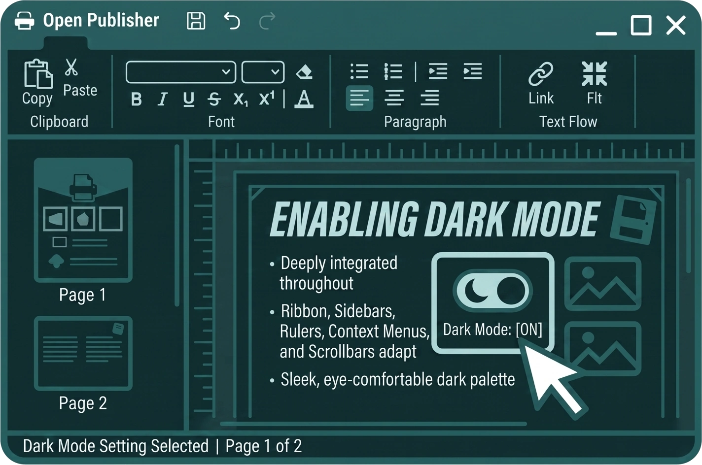
Open Publisher includes a full Dark Mode that transforms the entire application interface into a sleek, eye-comfortable dark palette. The Dark Mode engine is deeply integrated throughout every part of the application – the ribbon, sidebars, canvases, rulers, context menus, modals, and scrollbars all adapt automatically.
Enabling Dark Mode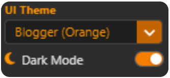
Toggle Dark Mode directly from the ribbon. The entire interface smoothly transitions to a dark grey palette ranging from #1a1a1a to #2d2d2d. Toggle it off at any time to return to the standard light interface.
Intelligent Icon Brightening
Standard dark UI elements are not legible against a dark ribbon. Open Publisher’s Dark Mode engine automatically boosts the brightness and saturation of all ribbon icons, labels, and dropdowns by 1.5x when Dark Mode is active, keeping your chosen theme colours rich and vivid while maximising legibility against the dark background.
Pitch-Black Theme Support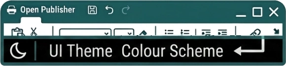
Ultra-dark themes such as Midnight Dark or Notion Black include special fallback logic. Rather than letting elements like the UI Theme label, moon icon, and colour scheme text vanish into the dark ribbon, the engine forcefully snaps them to a crisp #e0e0e0 white – guaranteeing every element remains legible even at the most extreme end of the darkness spectrum.
Adaptive Scrollbars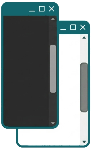
The scrollbar engine is fully rebuilt for Dark Mode:
-
The scrollbar track flips to dark grey (#2d2d2d) in Dark Mode to match the app UI.
-
Extreme dark themes force the scrollbar drag handle to a clearly visible #777 grey, so it is never invisible against the dark track.
-
Bright and neon themes gracefully drop to a translucent dark-grey drag handle in Light Mode so they remain visible, while retaining their vivid theme colours in Dark Mode.
What Adapts in Dark Mode
Dark Mode is applied comprehensively across the entire application. Every major UI surface is covered:
-
Ribbon & Toolbar – The main ribbon, contextual tabs (Text Box Tools, Picture Tools, WordArt Tools, Table Design, Drawing Tools), and the floating text editing toolbar all adopt the dark grey background automatically.
-
Sidebars – The Format Picture sidebar, Graphics Manager, Selection Pane, WordArt pane, and all other side panels replace their light-grey backgrounds with the dark acrylic panel colour.
-
Right-Click Context Menus – All custom context menus switch to dark backgrounds with native hover states, subtle divider lines, and dimmed disabled states.
-
Modal Windows – Dialogs including the Accessibility Checker, Custom Colour Picker, Clipart Gallery, Export as Image dialog, and Insert Symbol modal all adapt to dark panel backgrounds, dark inputs, and themed borders.
-
Clipart Gallery – The gallery grid background, search bar, and section dividers all switch to the dark palette, eliminating white gaps between sections.
-
Custom Colour Picker – The colour picker window, tabs, hex input, RGB spinners, swatches, and gradient canvas all inherit dark mode styling.
-
Delete Buttons – Delete buttons automatically brighten to a readable pastel red in Dark Mode, ensuring they remain clearly visible against the dark ribbon.
-
Dropdown Menus – Ribbon dropdowns dynamically detect if they would render outside the browser window and invert their alignment to stay fully on-screen.
Bright Theme Compatibility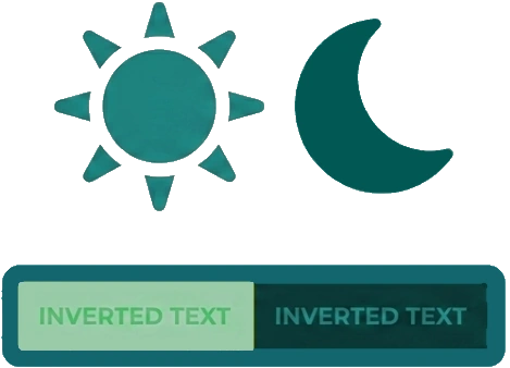
Dark Mode works in combination with all 100+ UI themes, including high-brightness themes like Snapchat Yellow. When a bright theme is active alongside Dark Mode, the engine detects the conflict and intelligently inverts text colours on buttons, labels, and navigation items to maintain strict contrast – so you never end up with white text on a yellow button or dark text disappearing into a dark panel.